Advertisment & Marketing
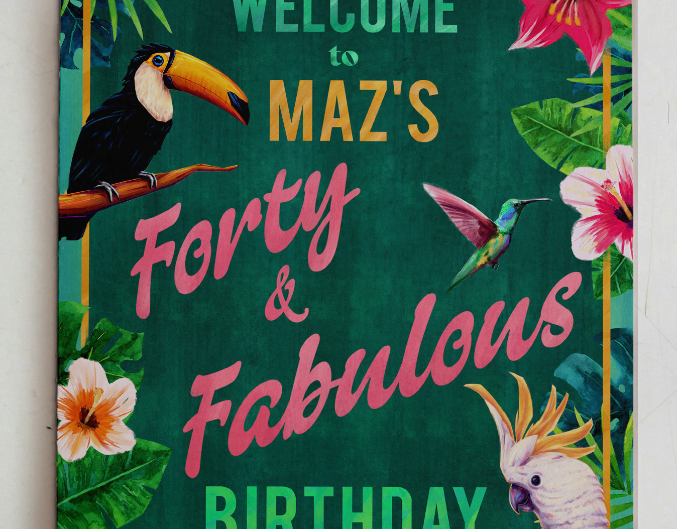
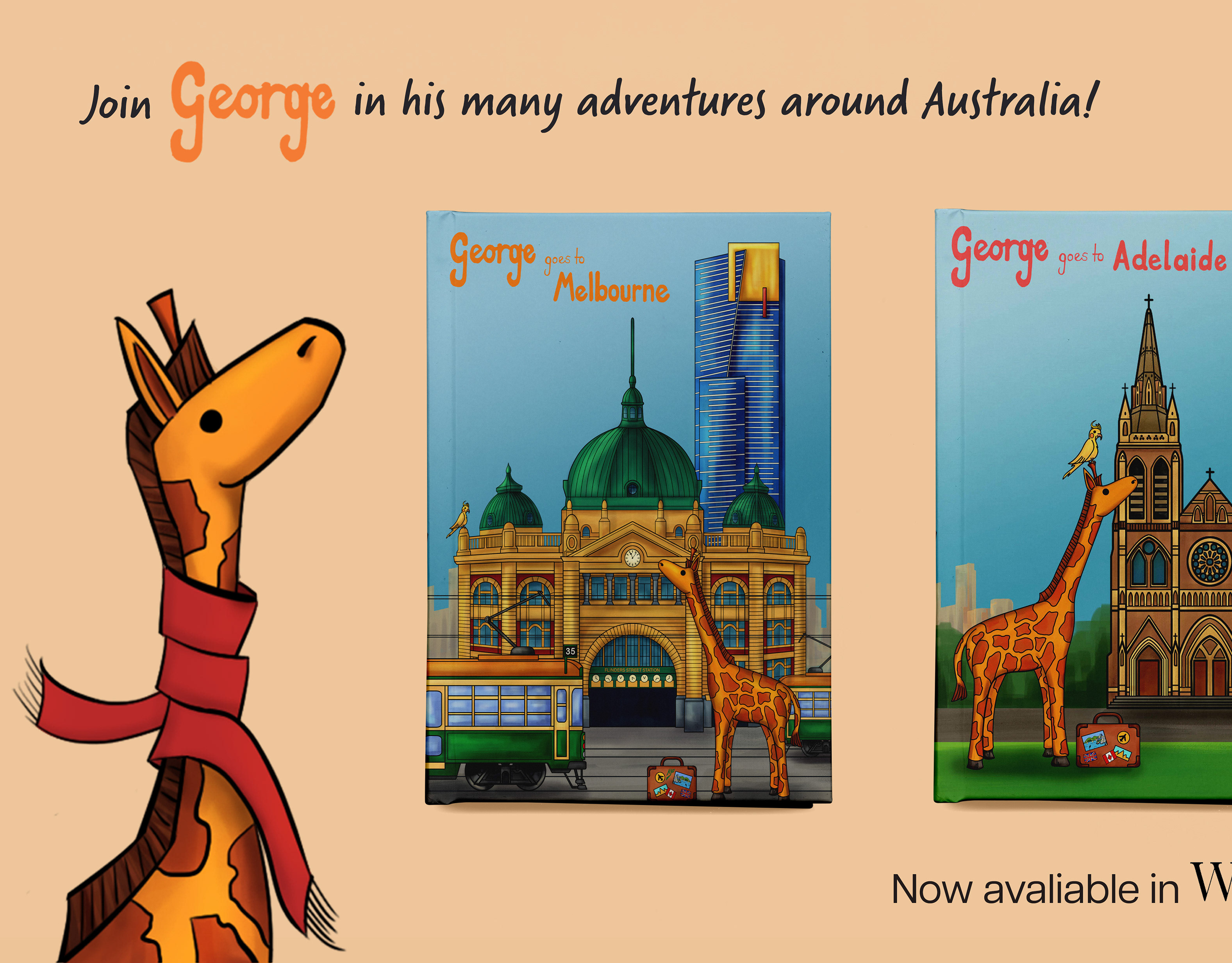
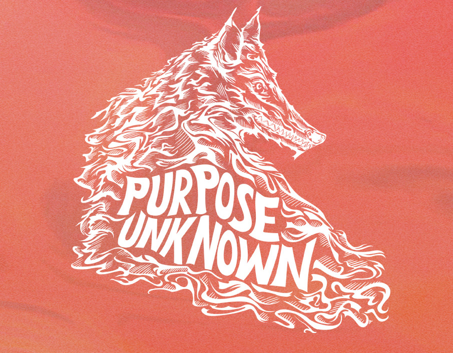
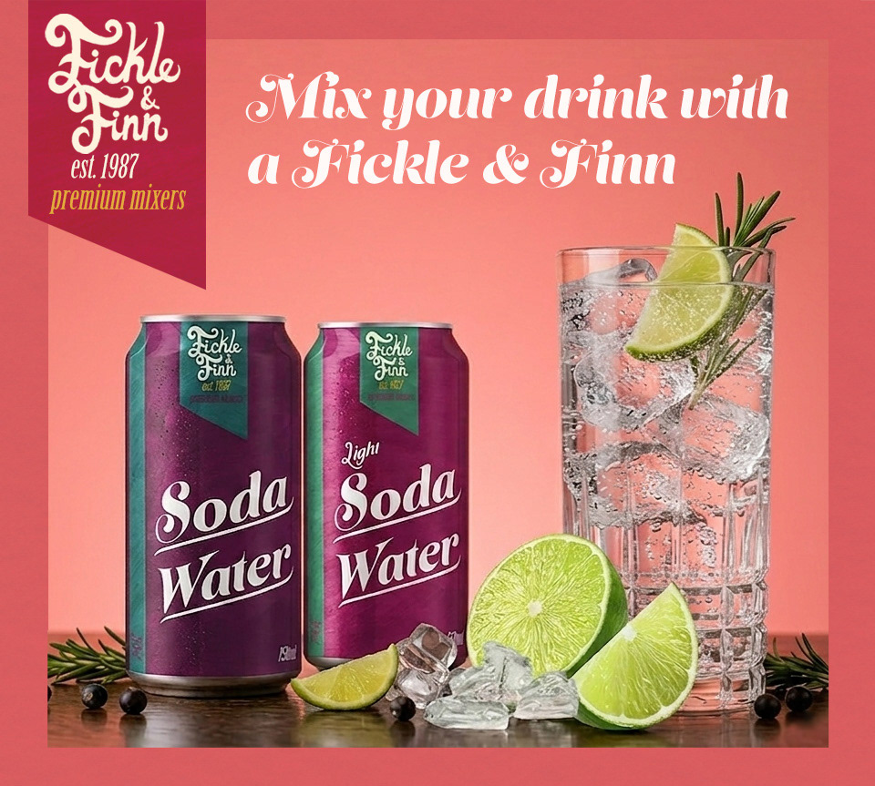
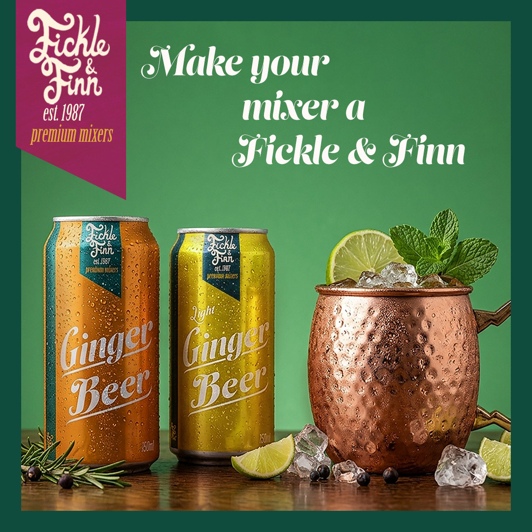
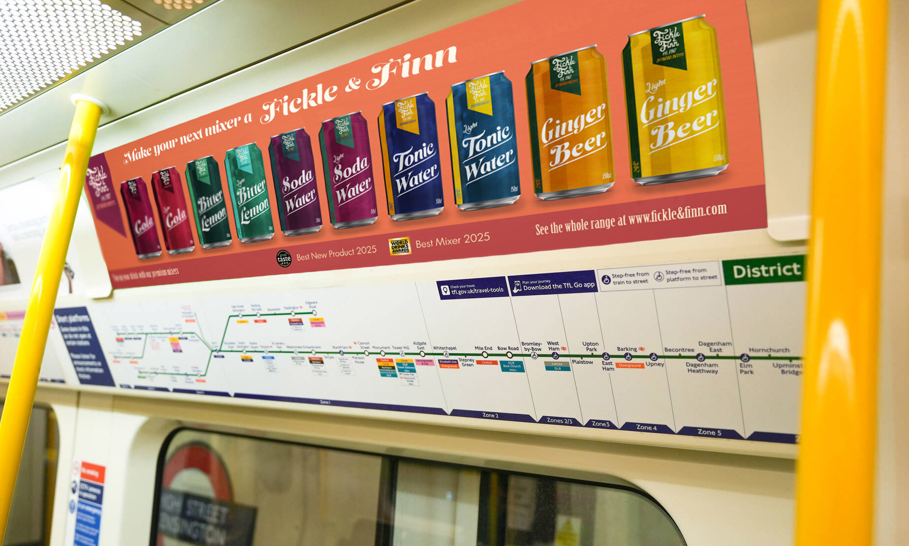
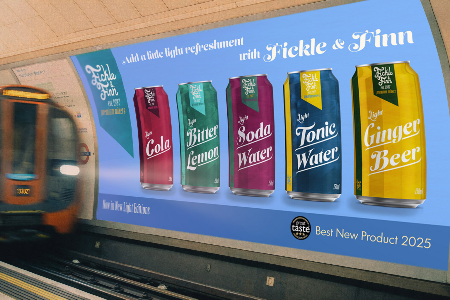
A series A collection of promotional graphics created for billboards, posters, and social media. The designs extend the brand’s visual identity across both print and digital platforms, ensuring a consistent and recognisable campaign presence.
Packaging
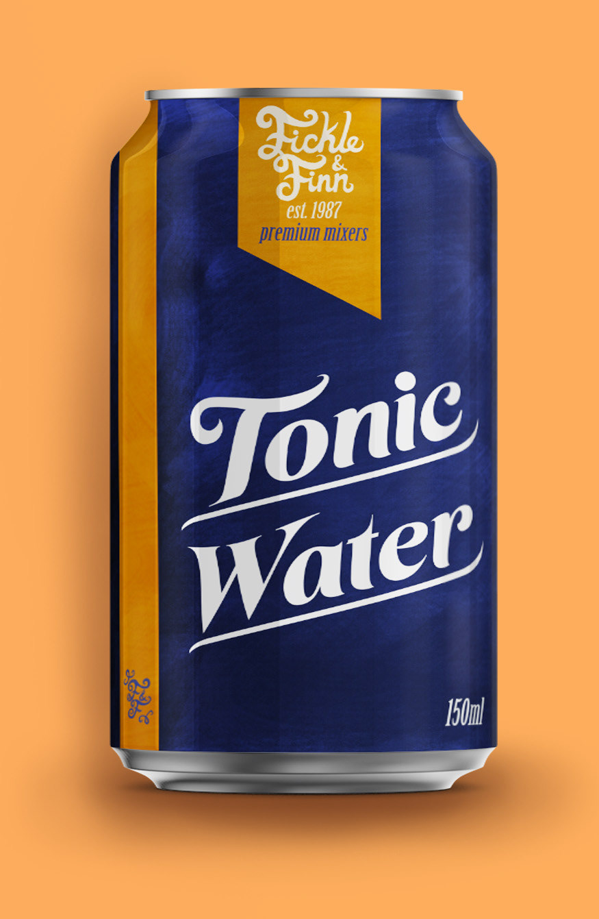
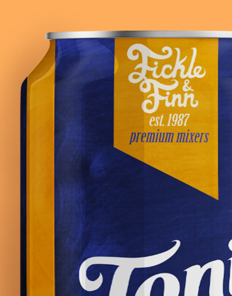
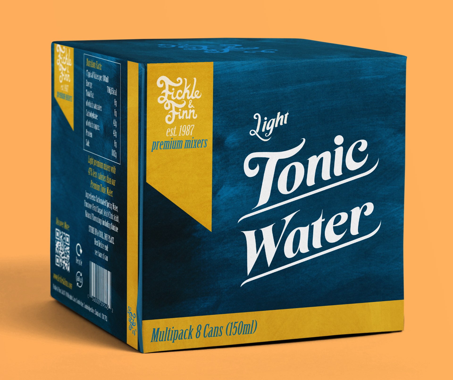
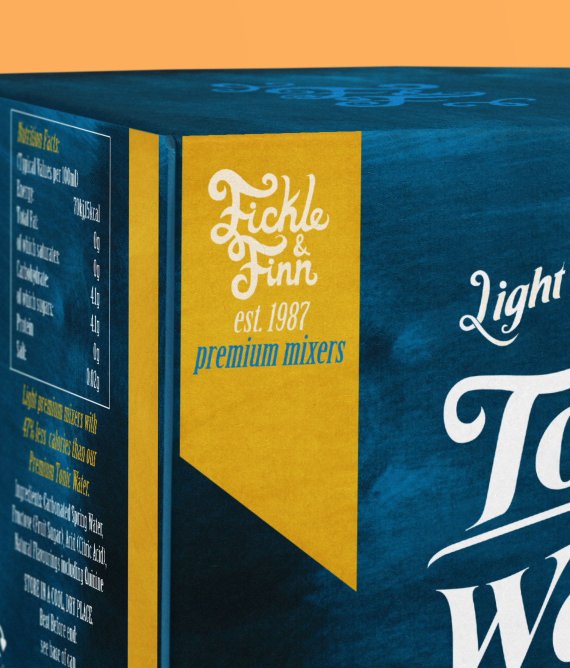
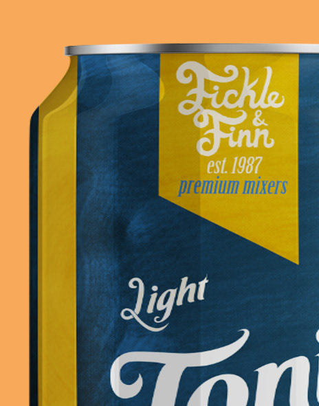
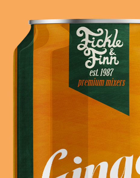
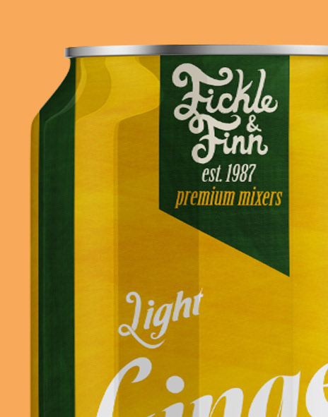
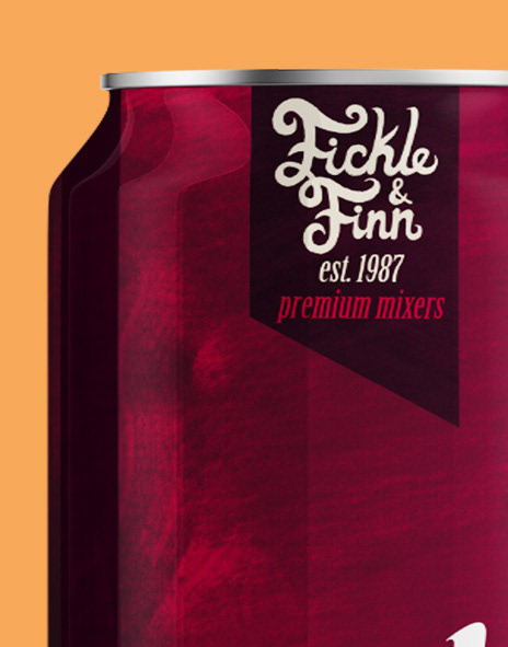
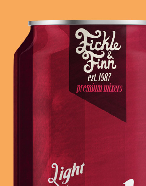
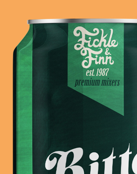
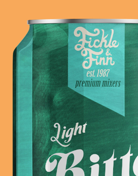
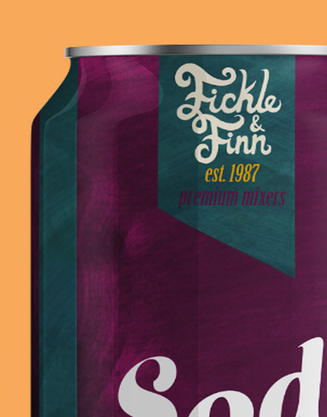
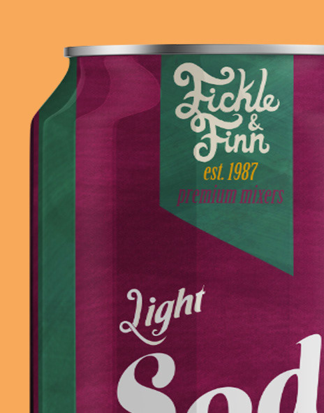
The packaging system reinforces instant brand recognition through a clear, colour-coded structure. Core mixers are defined by bold primary colours, while lighter variations are distinguished through softened tones — creating hierarchy within the range while maintaining visual consistency.

Logo Development
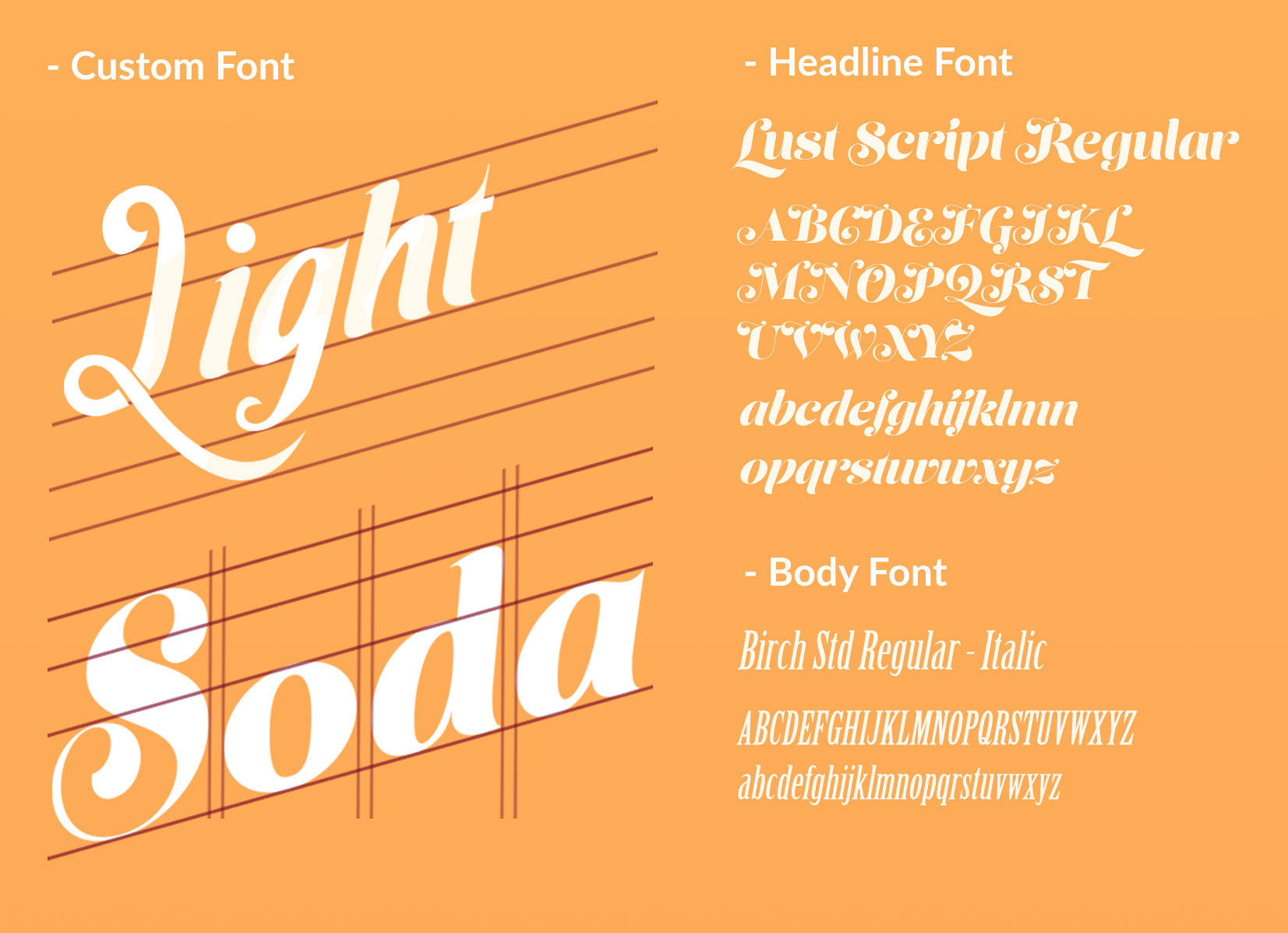
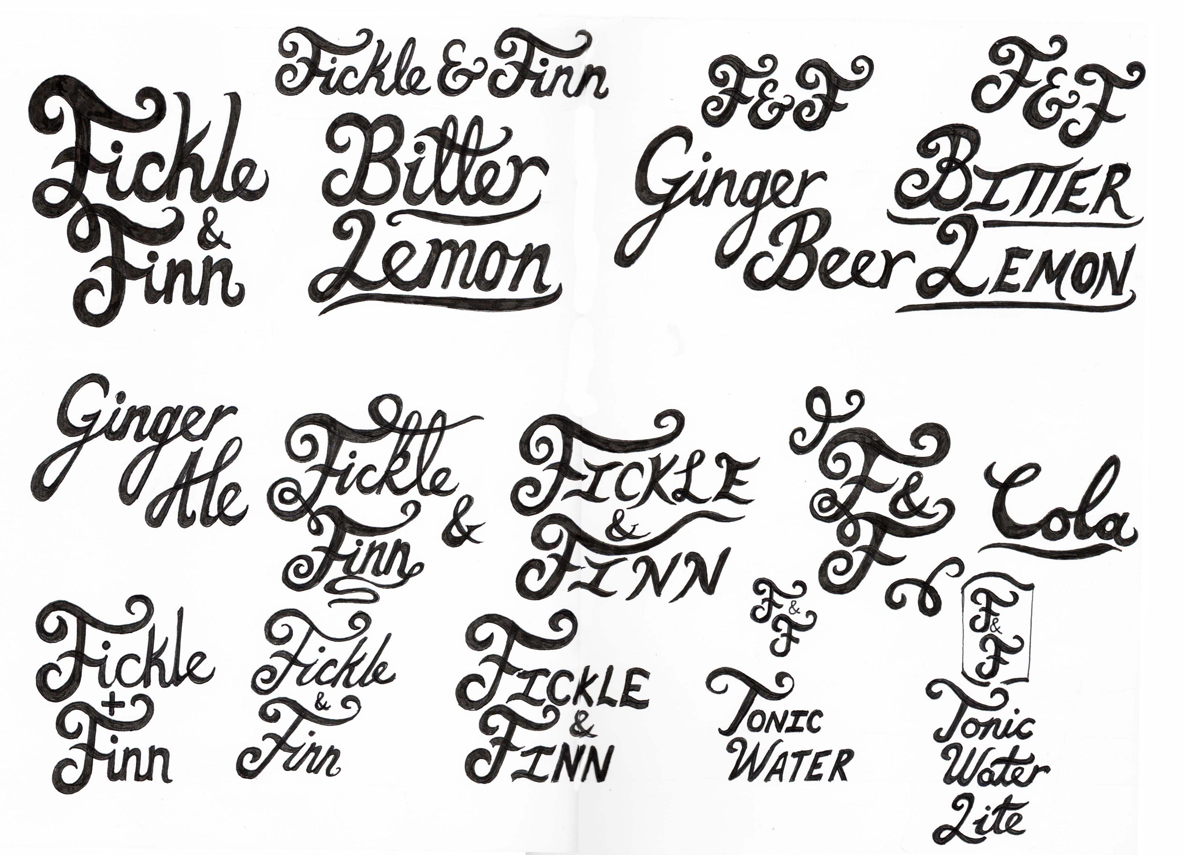
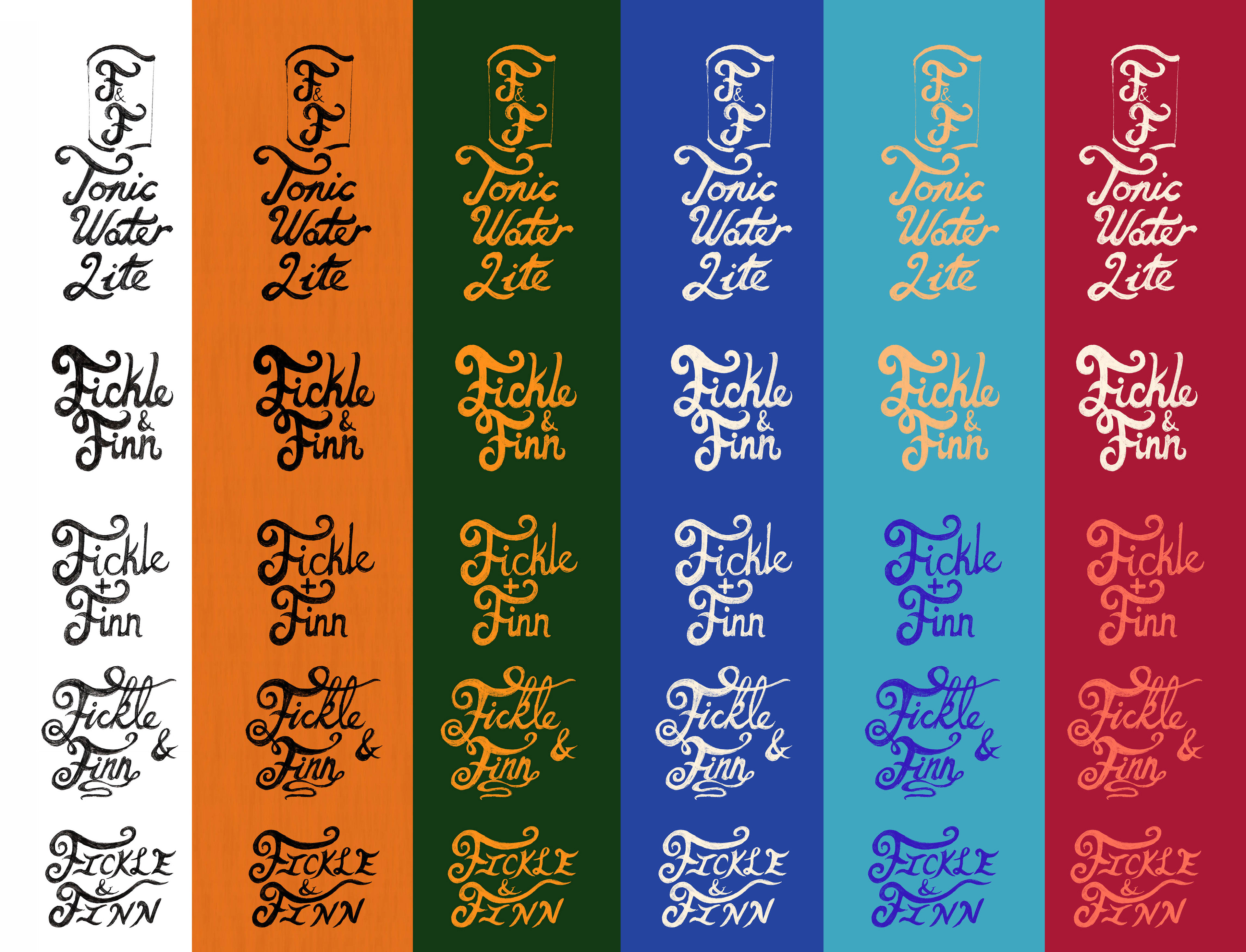
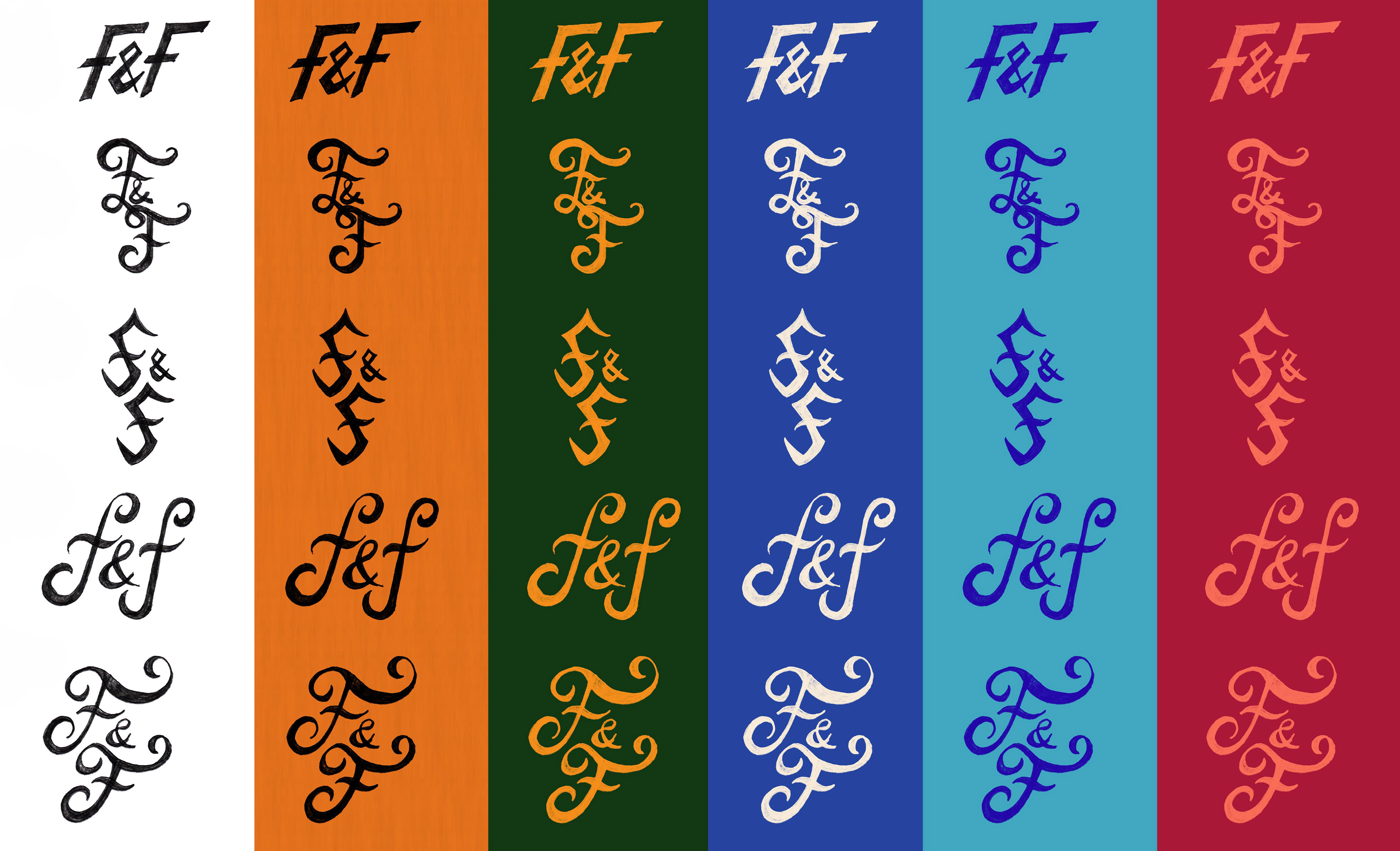
For the logo, I explored aclassic handwritten lettering style to evoke a traditional British feel. Theprocess began with hand-drawn calligraphy sketches before moving into digitalrefinement. I experimented with colour variations to test boldness, legibility,and overall impact, narrowing the options down to a design that felt bothdistinctive and authentic to the brand concept.
Final Thoughts
This project helped me broaden my design skills by creating a fictional brand of premium mixers that could exist in a real-world setting. It allowed me to explore the full design process — from logo development and product design to branding and marketing — while expanding my proficiency in Photoshop. Through this project, I developed a cohesive visual identity and gained a deeper understanding of how consistent branding can bring a concept to life.


