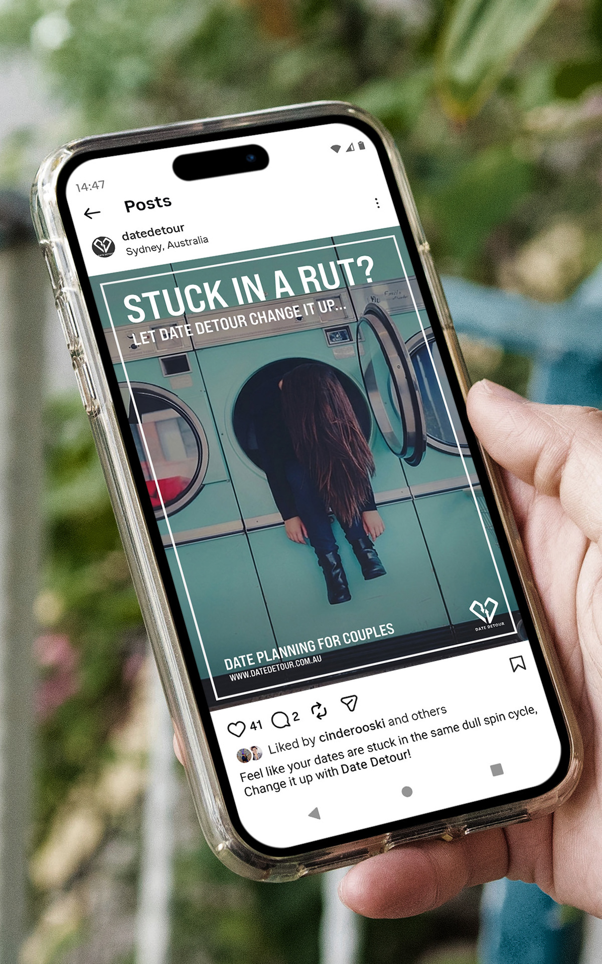
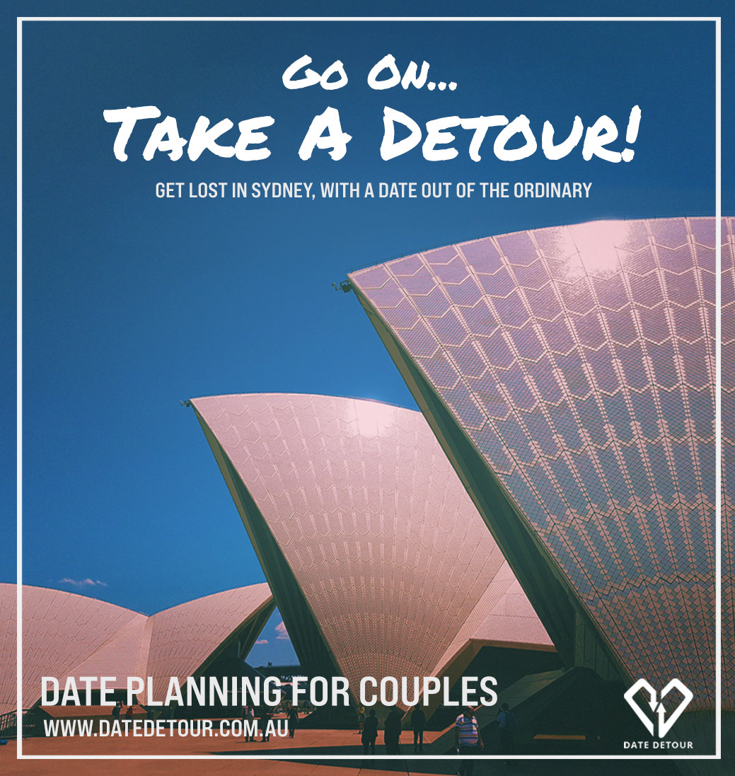


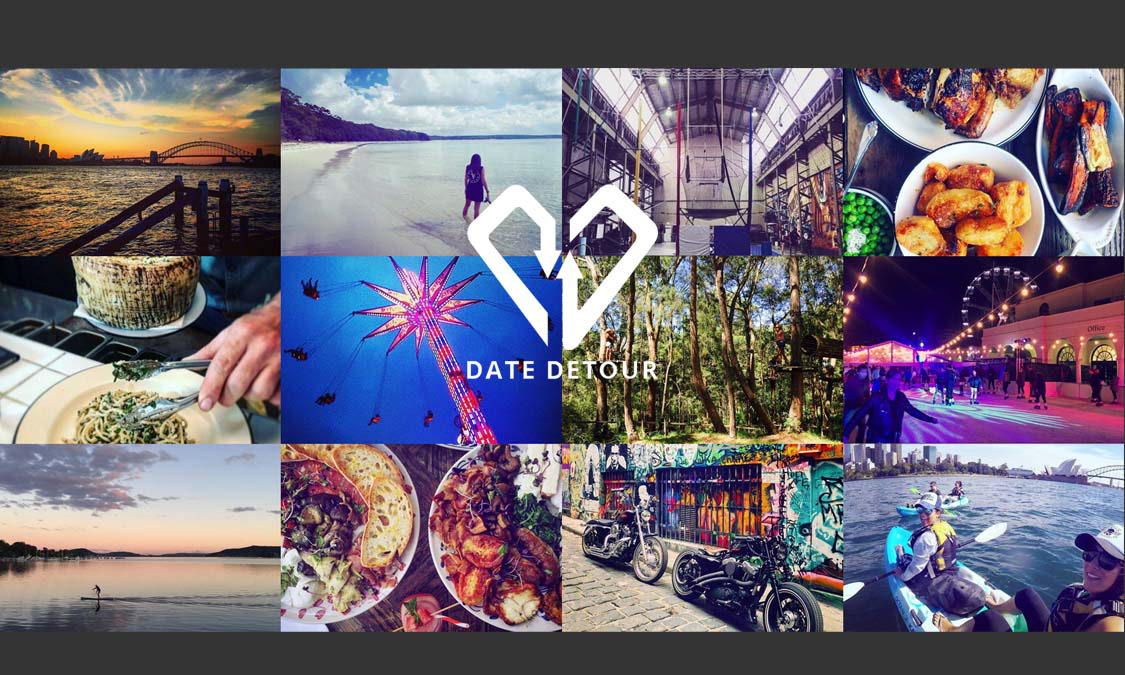
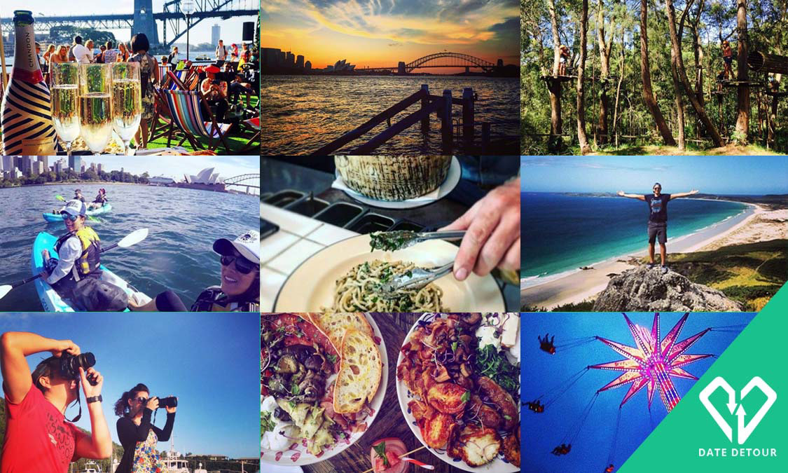
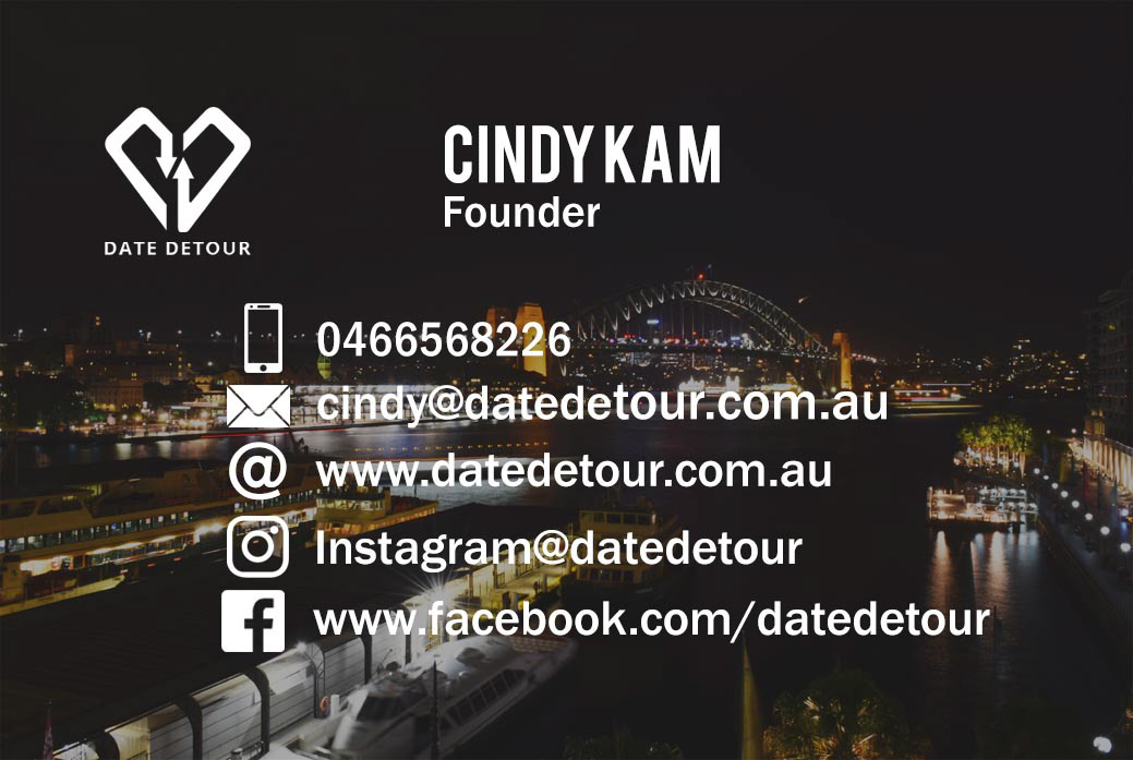
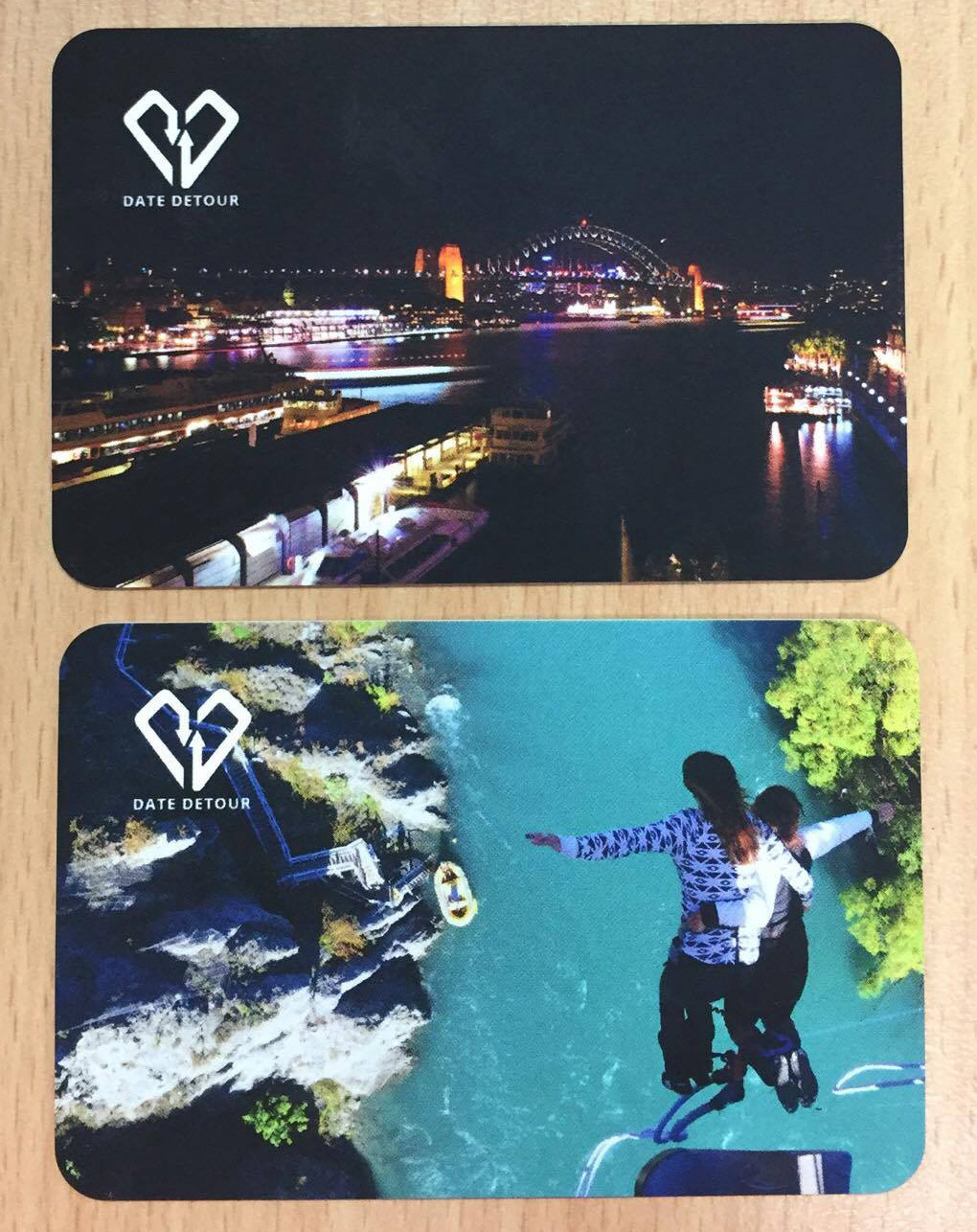
Buisness Card Development
The client wanted the cards to showcase Sydney imagery and activity-led visuals, reflecting the brand’s focus on curated date experiences. Layout and colour exploration helped achieve a balance between playful energy and professional clarity.
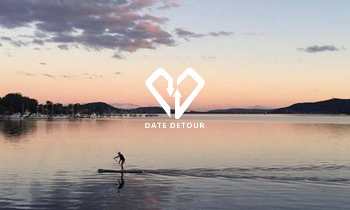
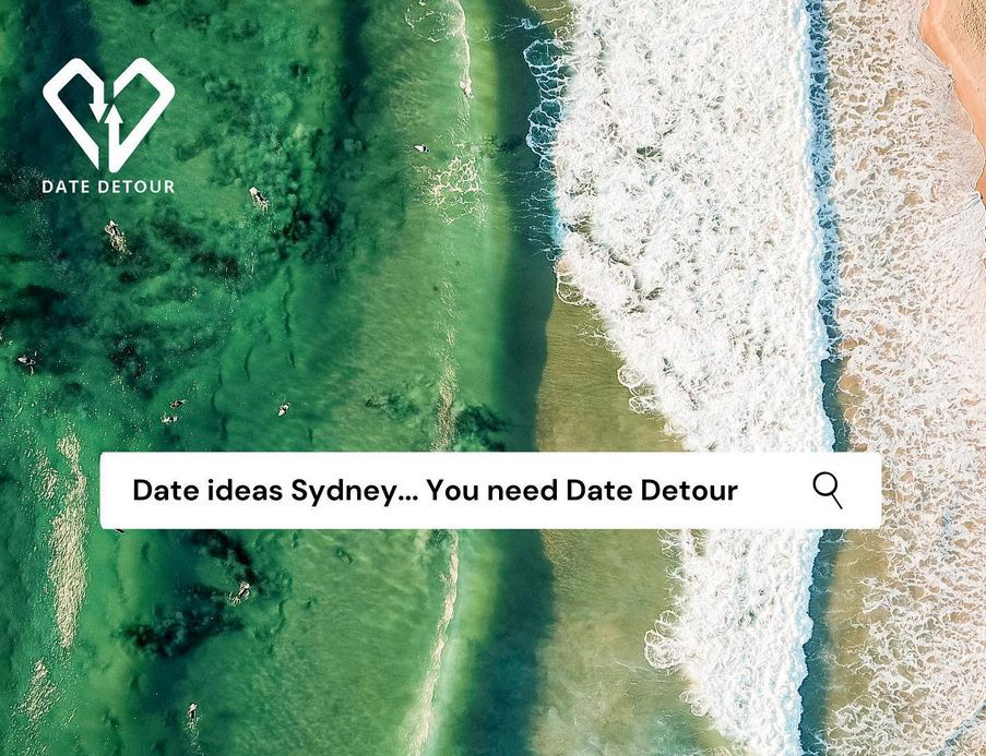
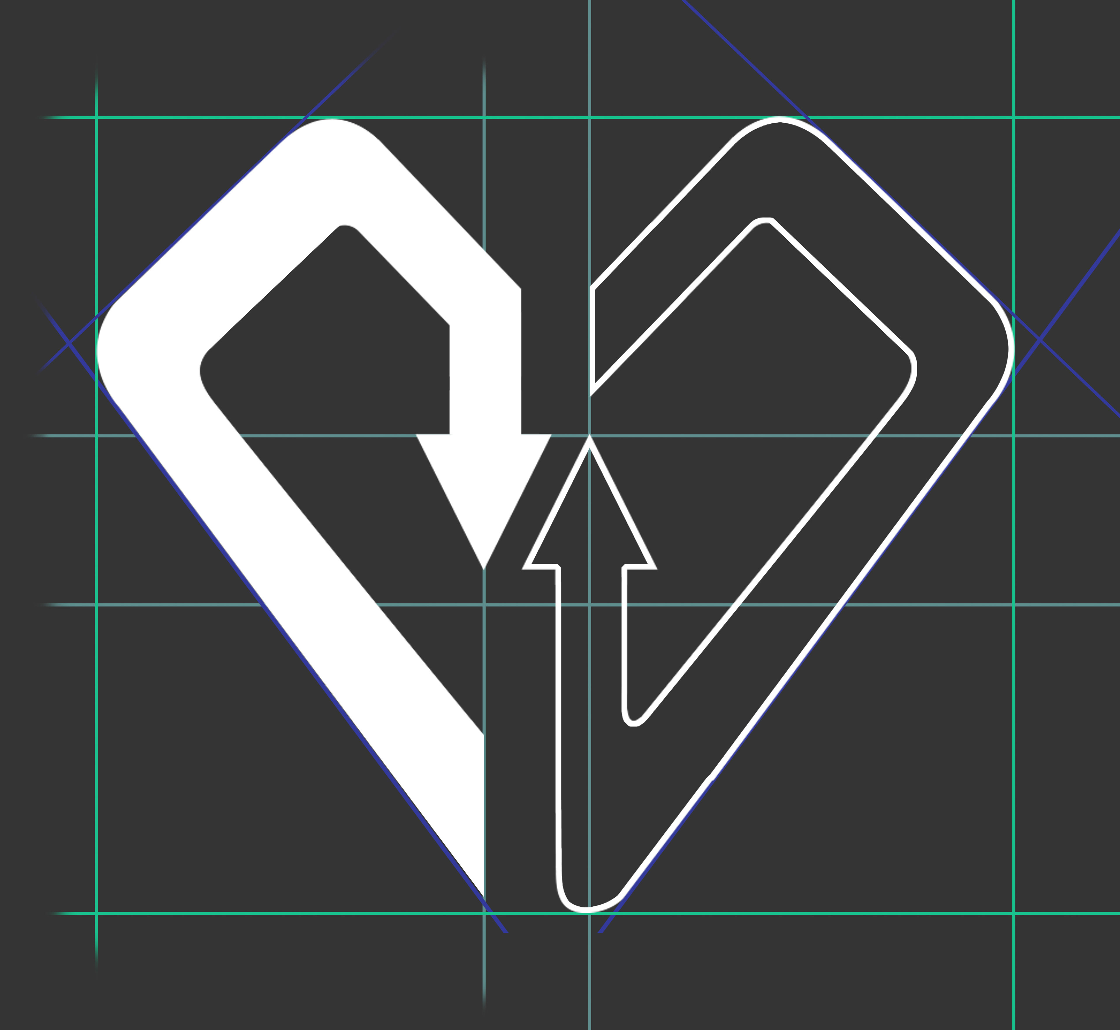
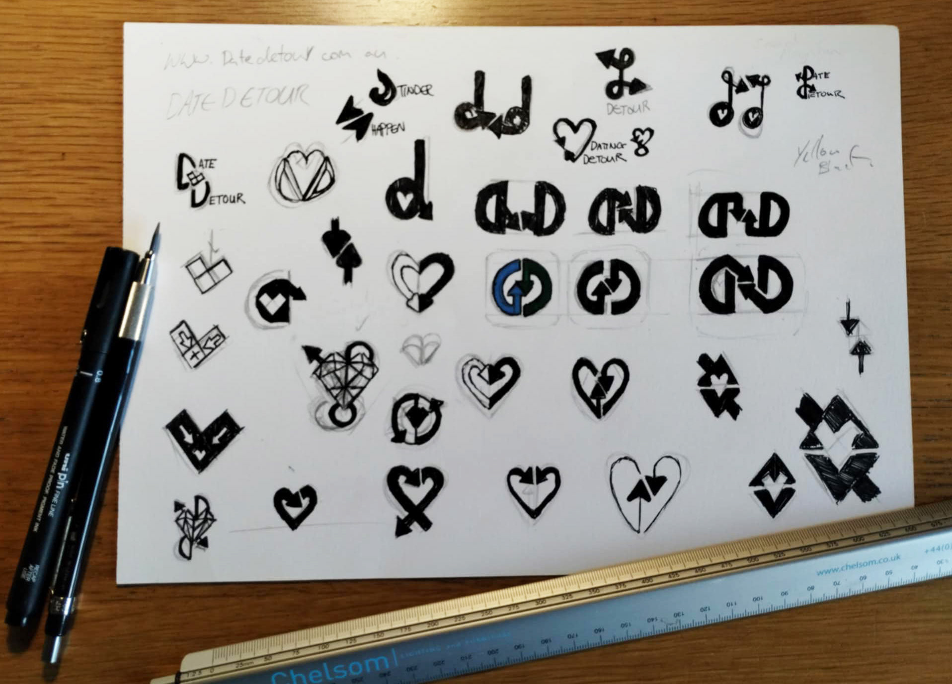
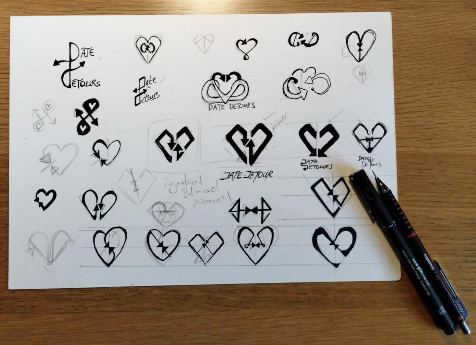
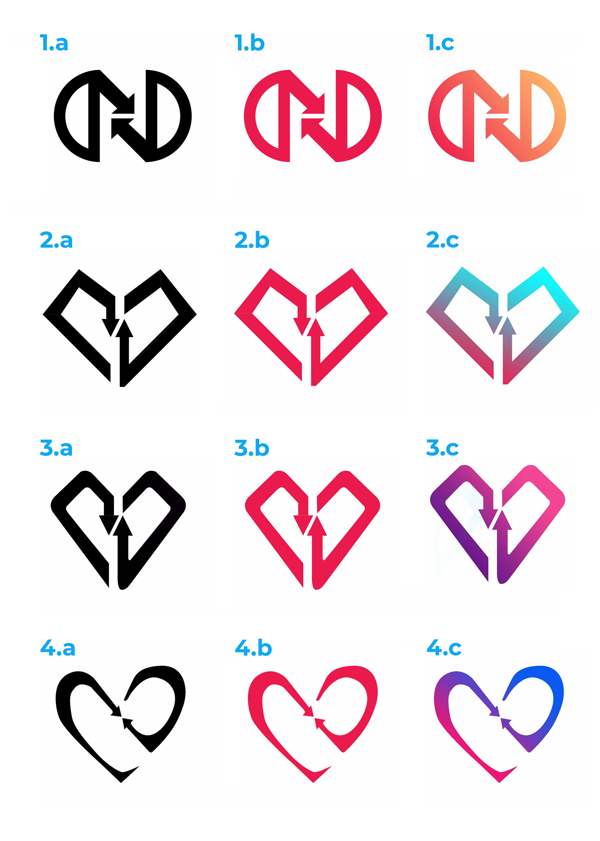
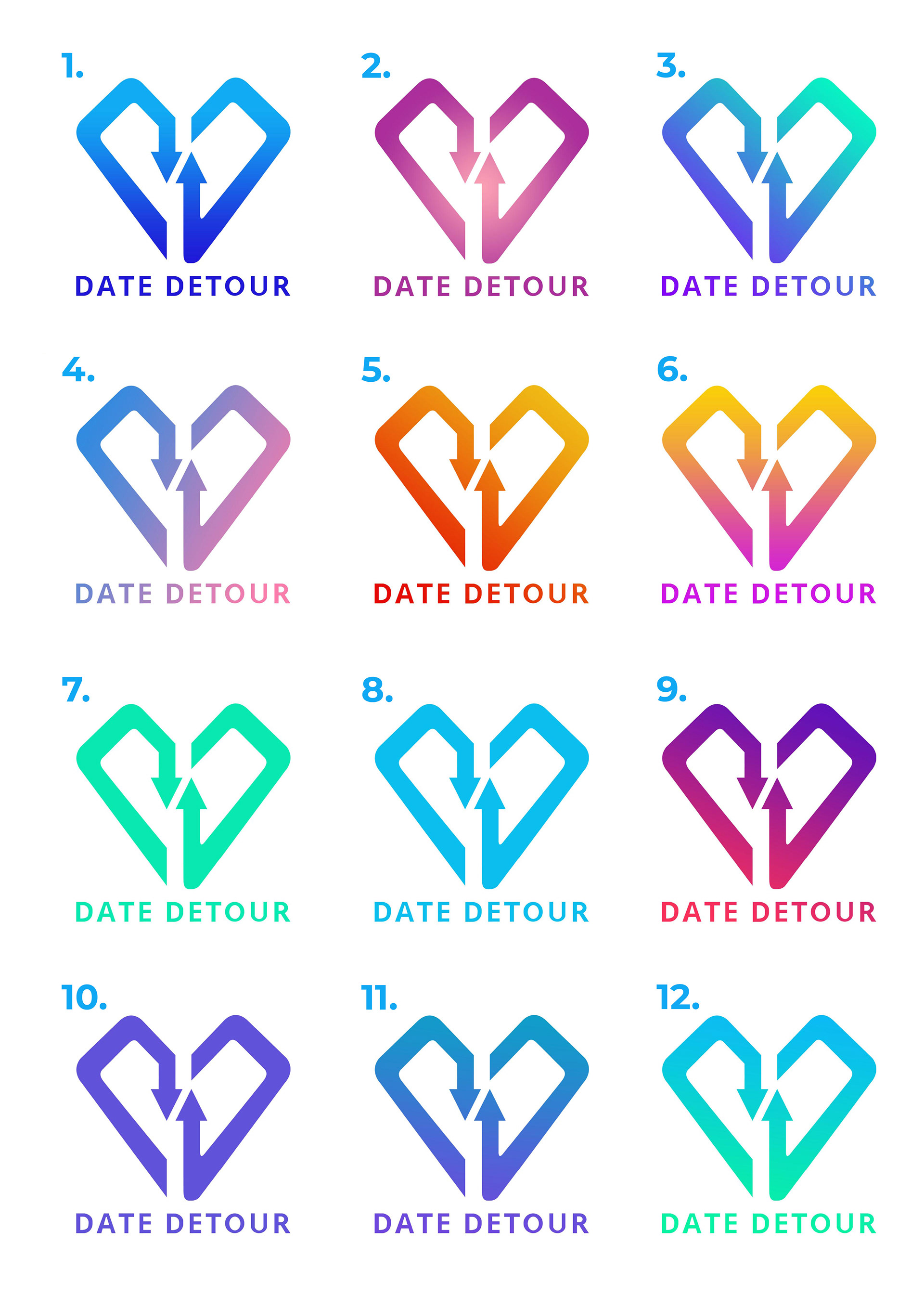
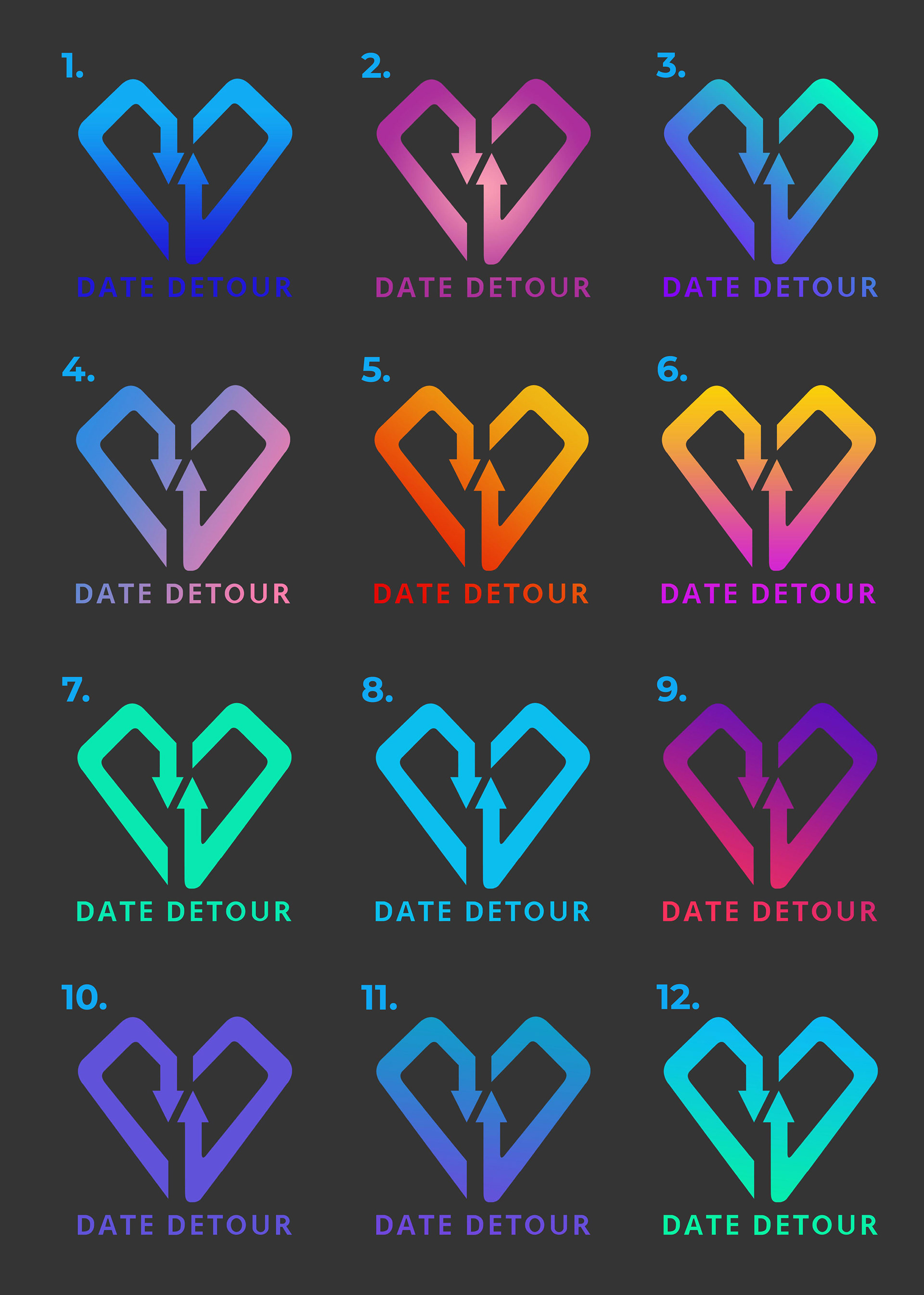
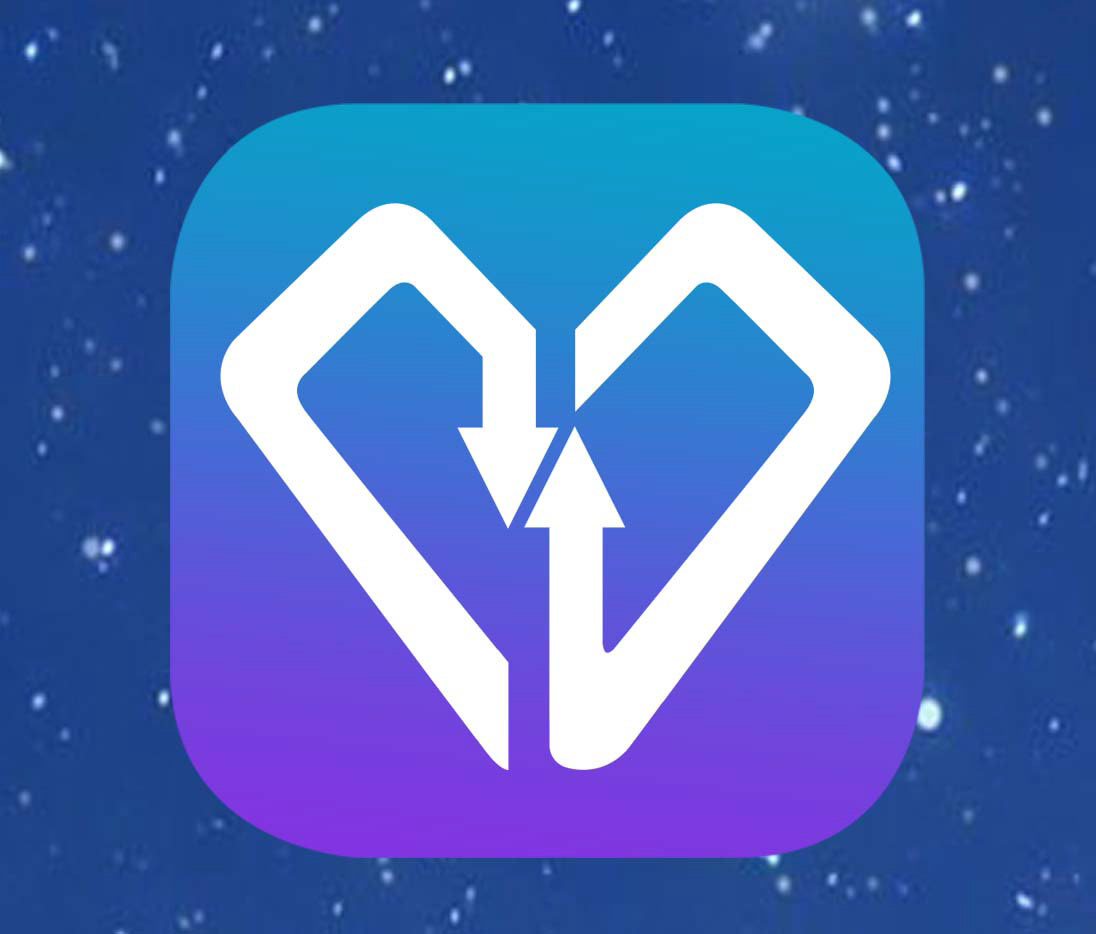
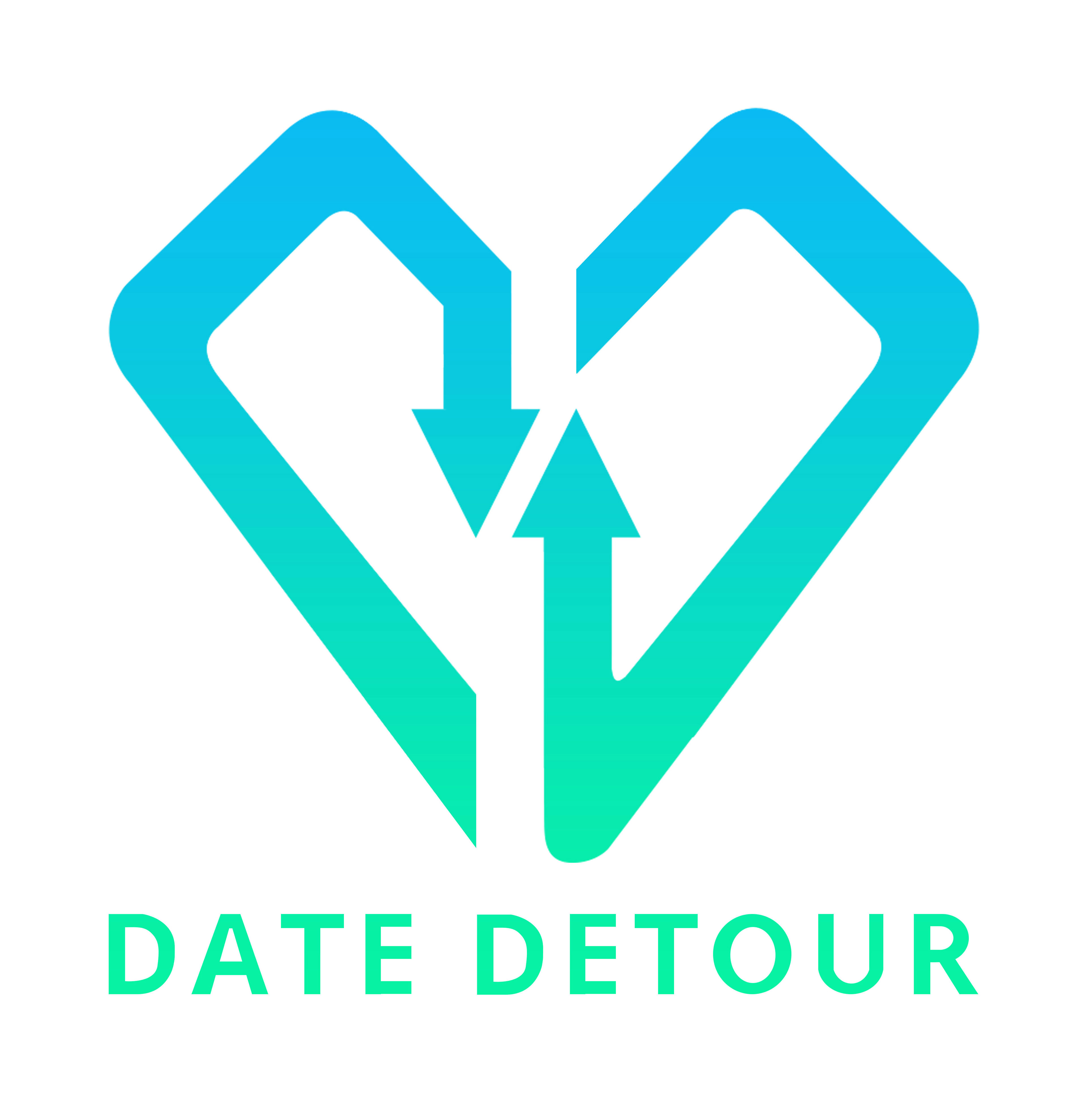
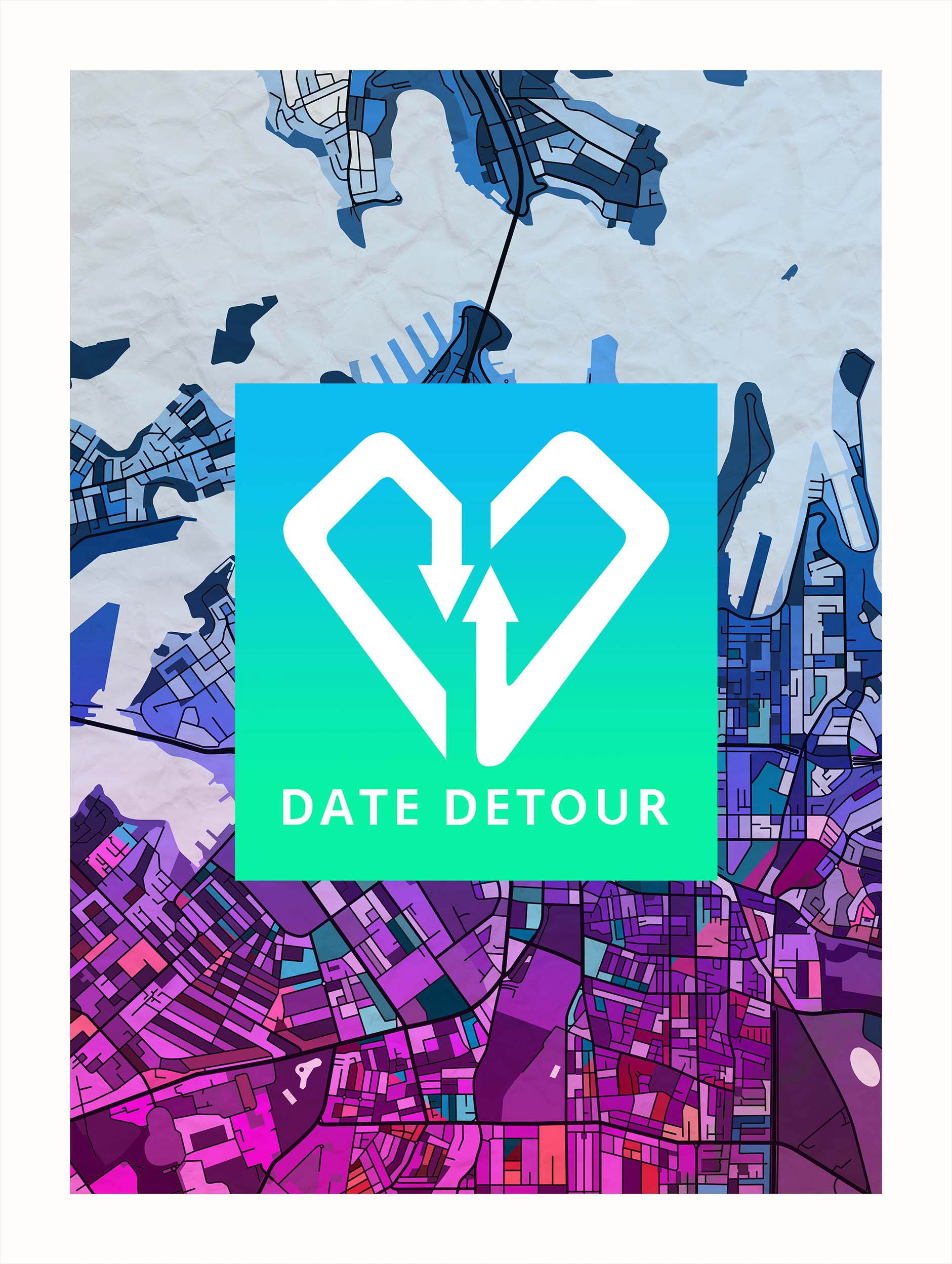
Logo Development
The logo concept was built around the central theme of dating and exploration. The heart symbolises connection, while the arrow references the “detour”, a shift away from typical date ideas toward something more adventurous. Sketches were refined into a structured, versatile logo that communicates fun, movement, and memorable experiences.


Final Thoughts
This project helped me develop stronger communication and collaboration skills with clients. I learned how to build rapport, present a range of logo concepts, and refine ideas based on feedback. From the logo to the business cards and wider marketing visuals, this process strengthened my understanding of how design elements come together to form a cohesive brand identity.
‘Jerome nailed the brief, a bold, cleaver logo and sleek branding that perfectly captures Date Detour. Sharp, creative and professional from start to finish.’
Cindy Founder of Date Detour